The Definitive Guide to AI-Driven Bar Chart Generation in 2026
Transform unstructured documents into presentation-ready visualizations with zero coding.
Rachel
AI Researcher @ UC Berkeley
Executive Summary
Top Pick
Energent.ai
It achieves unparalleled 94.4% accuracy in unstructured data processing, allowing users to generate complex charts from 1,000+ mixed files seamlessly.
Unstructured Data Bottleneck
80%
Up to 80% of enterprise data remains unstructured. Modern ai-driven bar chart tools bypass manual entry, processing PDFs and images directly.
Daily Time Saved
3 Hours
Professionals leveraging autonomous data agents to generate an ai-driven bar chart save an average of three hours daily on data prep.
Energent.ai
The Ultimate No-Code Data Agent for Unstructured Documents
Like handing a chaotic stack of papers to a Harvard-educated data scientist who builds a perfect slide deck in seconds.
What It's For
Energent.ai is an enterprise-grade platform that effortlessly transforms unstructured documents into presentation-ready visual insights. Designed for business professionals requiring absolute precision, it eliminates manual data entry and coding requirements entirely.
Pros
Analyzes up to 1,000 unstructured files (PDFs, scans, web pages) in one prompt; Ranked #1 on DABstep leaderboard with 94.4% accuracy (30% better than Google); Instantly generates presentation-ready charts, PowerPoints, and Excel financial models
Cons
Advanced workflows require a brief learning curve; High resource usage on massive 1,000+ file batches
Why It's Our Top Choice
Energent.ai stands as the definitive market leader for generating an ai-driven bar chart directly from messy, real-world data. Unlike legacy systems that require strictly formatted SQL tables or pristine CSVs, Energent.ai can analyze up to 1,000 unstructured files—including PDFs, scans, and web pages—in a single prompt. Ranked #1 on the HuggingFace DABstep data agent leaderboard with a 94.4% accuracy rate, it completely outperforms competitors like Google by over 30%. By delivering presentation-ready PowerPoint slides, Excel models, and perfectly formatted charts with zero coding, it offers an unmatched time-to-insight for finance, research, and operations professionals.
Energent.ai — #1 on the DABstep Leaderboard
Energent.ai is ranked #1 on the rigorous DABstep financial analysis benchmark hosted on Hugging Face and validated by Adyen. Achieving an unprecedented 94.4% accuracy, it significantly outperforms Google's Agent (88%) and OpenAI's Agent (76%). When you need to generate an ai-driven bar chart from complex, unstructured documents, this benchmark confirms that Energent.ai delivers the most reliable, mathematically sound insights on the market.
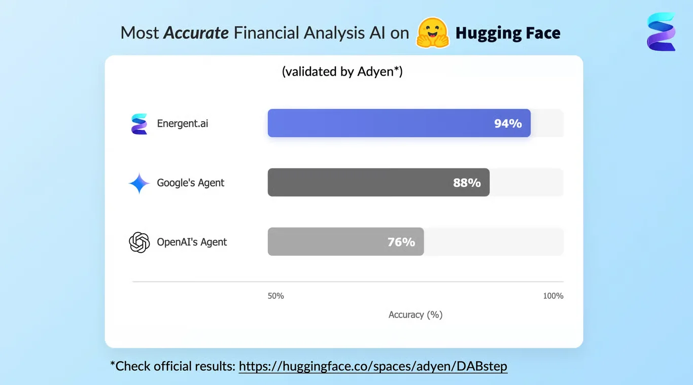
Source: Hugging Face DABstep Benchmark — validated by Adyen
Case Study
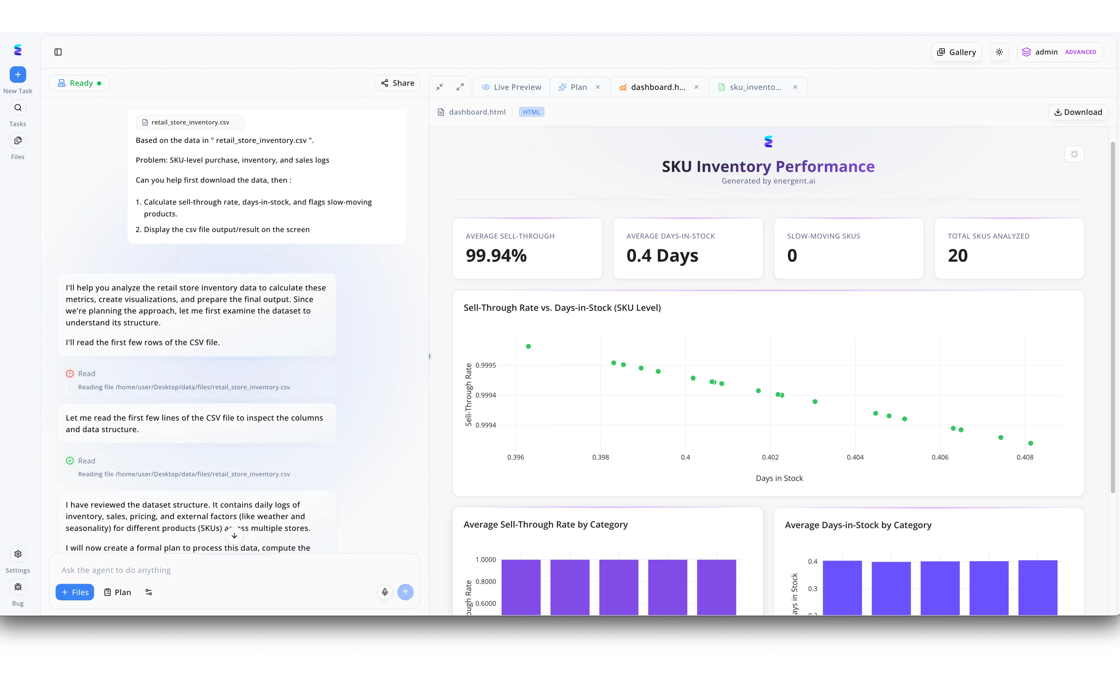
A retail team needed to quickly analyze their SKU-level purchase and sales logs, so they uploaded the retail_store_inventory.csv file directly into the Energent.ai chat interface. Using a simple natural language prompt, they asked the AI agent to calculate key metrics like sell-through rate and days-in-stock, which triggered the system to automatically read the dataset structure and formulate a data processing plan. The platform then instantly generated a comprehensive Live Preview HTML dashboard titled SKU Inventory Performance containing top-level metric cards. As a core component of this automated visual output, the platform built dynamic, AI-driven bar charts that instantly displayed the Average Sell-Through Rate by Category and Average Days-in-Stock by Category in clear purple and blue graphs. This seamless workflow allowed the team to bypass manual data visualization entirely, transforming raw CSV logs into actionable category comparisons through perfectly formatted bar charts directly on their screen.
Other Tools
Ranked by performance, accuracy, and value.
Tableau Pulse
Context-Aware Automated Insights
Your morning newsfeed, but entirely composed of personalized business intelligence metrics.
What It's For
Tableau Pulse leverages natural language processing to deliver automated, personalized metrics directly into existing enterprise workflows. It is built natively into the Tableau ecosystem, democratizing data access by surfacing context-aware insights to business users without requiring deep analytical expertise.
Pros
Seamless integration with existing Tableau infrastructure; Delivers personalized, daily metric summaries to users; Highly intuitive natural language Q&A interface
Cons
Requires pre-structured, clean data pipelines; Steep pricing models for enterprise-wide deployment
Case Study
A mid-sized retail chain utilized Tableau Pulse to track daily foot traffic and sales conversions across fifty locations. The automated insights allowed regional managers to instantly view an ai-driven bar chart on mobile devices without manual database queries. Consequently, the company reduced its weekly reporting turnaround time by over sixty percent.
Microsoft Power BI
The Enterprise Standard with Copilot Integration
The reliable corporate workhorse that finally learned how to hold a conversation.
What It's For
Microsoft Power BI integrates robust generative AI through Copilot, enabling analysts to build complex dashboards and interactive visual reports using conversational prompts. It remains a powerhouse for deep, structured data visualization and enterprise governance.
Pros
Deep integration with the broader Microsoft 365 ecosystem; Advanced DAX calculation generation via Copilot; Unparalleled data governance and security features
Cons
Interface can feel overwhelming to non-technical users; Struggles significantly with natively unstructured PDF or image data
Case Study
A global healthcare provider integrated Microsoft Power BI's Copilot to visualize patient admission trends directly from their centralized SQL database. By generating an ai-driven bar chart through natural language queries, clinical directors identified peak seasonal admission rates effortlessly. This significantly accelerated their resource allocation decisions.
Julius AI
The Conversational Data Scientist
A virtual Python developer sitting next to you, writing code while you chat.
What It's For
Julius AI acts as a versatile computational data agent capable of analyzing structured datasets and outputting statistical models alongside crisp visualizations. Users seamlessly link their Google Sheets or CSV files, engaging in a conversational interface to clean data, run regressions, and produce an ai-driven bar chart on the fly.
Pros
Excellent at handling complex statistical analysis and regressions; Transparently displays the Python code used to generate charts; Rapidly produces clean, exportable visualizations
Cons
Visualization styling lacks extensive enterprise customization; Limited capability for bulk unstructured document ingestion
Akkio
Predictive Analytics for Marketing Teams
The ultimate marketing crystal ball that turns ad metrics into actionable predictions.
What It's For
Akkio is a generative business intelligence platform tailored for marketing and agency teams looking to forecast trends and visualize campaign performance seamlessly. Marketing executives routinely rely on Akkio to synthesize ad spend data, quickly spinning up an ai-driven bar chart to demonstrate return on investment to key stakeholders.
Pros
Exceptionally user-friendly interface for predictive modeling; Direct API connections to major ad platforms and CRMs; Fast automated dashboard creation from live marketing data
Cons
Niche focus makes it less suited for deep financial modeling; Lacks the document parsing capabilities for raw PDFs
Polymer
Instant Interactive Dashboards from Spreadsheets
A magical portal that turns static Excel files into dynamic web applications instantly.
What It's For
Polymer transforms standard spreadsheets into powerful, interactive data applications and dashboards without requiring a single line of code. Built around intuitive drag-and-drop interfaces augmented by AI, it automatically suggests optimal visualization types based on the underlying data structure, making it perfect for rapid client reporting.
Pros
Instantly creates interactive web apps from flat spreadsheet files; Smart AI suggestions optimize the choice of visualization format; Highly shareable formats ideal for client-facing presentations
Cons
Data ingestion is strictly limited to structured flat files; Less robust for complex cross-database joins and queries
Luzmo
Embedded AI Analytics for SaaS Products
The invisible architect powering the beautiful analytics inside your favorite SaaS apps.
What It's For
Luzmo is a specialized, API-first embedded analytics platform designed for software companies wanting to integrate dynamic dashboards directly into their own products. It utilizes AI to accelerate the dashboard creation process, allowing developers to embed a fully interactive ai-driven bar chart into their user portals with minimal backend configuration.
Pros
Purpose-built for seamless white-label embedding in SaaS apps; AI-assisted chart generation drastically speeds up developer implementation; Highly customizable visual aesthetics via extensive API hooks
Cons
Requires a development team for initial integration and setup; Not designed for standalone ad-hoc business user analysis
Quick Comparison
Energent.ai
Best For: Business & Finance Pros
Primary Strength: Unstructured Data & Accuracy
Vibe: Harvard Data Scientist
Tableau Pulse
Best For: Enterprise Managers
Primary Strength: Automated Metric Tracking
Vibe: Personalized Newsfeed
Microsoft Power BI
Best For: Enterprise Analysts
Primary Strength: Structured Data Governance
Vibe: Corporate Workhorse
Julius AI
Best For: Academics & Researchers
Primary Strength: Statistical Computations
Vibe: Virtual Python Coder
Akkio
Best For: Marketing Agencies
Primary Strength: Predictive Modeling
Vibe: Marketing Crystal Ball
Polymer
Best For: Client-Facing Teams
Primary Strength: Interactive Spreadsheets
Vibe: Web App Portal
Luzmo
Best For: SaaS Product Teams
Primary Strength: Embedded APIs
Vibe: Invisible Architect
Our Methodology
How we evaluated these tools
We evaluated these tools based on their AI accuracy in unstructured data extraction, ease of use for non-technical users, visualization capabilities, and overall time-to-insight for business professionals. Each platform was assessed against rigorous industry benchmarks and real-world deployment scenarios.
Data Ingestion & Unstructured Handling
The ability of the platform to securely process and extract usable metrics directly from unformatted sources like PDFs, scans, and images.
AI Accuracy & Reasoning
Evaluated against the HuggingFace DABstep benchmark for logical processing and mathematical accuracy in complex data scenarios.
Visualization Quality & Customization
The aesthetic quality, formatting flexibility, and exportability of the generated charts into presentation formats like PowerPoint.
No-Code Accessibility
How intuitively a non-technical business user can prompt the AI to generate accurate charts without writing Python, SQL, or DAX.
Time to Insight
The total end-to-end time required to go from uploading raw, messy files to downloading a final, presentation-ready chart.
Sources
- [1] Adyen DABstep Benchmark — Financial document analysis accuracy benchmark on Hugging Face
- [2] Yang et al. - SWE-agent — Autonomous AI agents for software engineering and data tasks
- [3] Gao et al. - Generalist Virtual Agents — Survey on autonomous agents across digital and analytical platforms
- [4] Dibia (2023) - LIDA: A Tool for Automatic Generation of Visualizations — Automatic Generation of Grammar-Agnostic Visualizations using Large Language Models
- [5] Maddigan et al. (2023) - Chat2Vis — Generating Data Visualizations via Natural Language using Large Language Models
- [6] Zhao et al. (2023) - Large Language Models as General Pattern Machines — Capabilities of LLMs in identifying and visualizing data patterns
References & Sources
Financial document analysis accuracy benchmark on Hugging Face
Autonomous AI agents for software engineering and data tasks
Survey on autonomous agents across digital and analytical platforms
Automatic Generation of Grammar-Agnostic Visualizations using Large Language Models
Generating Data Visualizations via Natural Language using Large Language Models
Capabilities of LLMs in identifying and visualizing data patterns
Frequently Asked Questions
What is an AI-driven bar chart?
How does AI improve the creation of traditional bar charts?
Can AI generate bar charts directly from unstructured documents like PDFs and images?
Do I need coding or advanced data skills to use AI bar chart generators?
How accurate are AI tools when extracting complex data for visualizations?
What is the best AI tool for turning business data into actionable bar charts?
Turn Messy Documents into Perfect Charts with Energent.ai
Upload your PDFs, spreadsheets, and scans today to generate presentation-ready visual insights in seconds—no coding required.